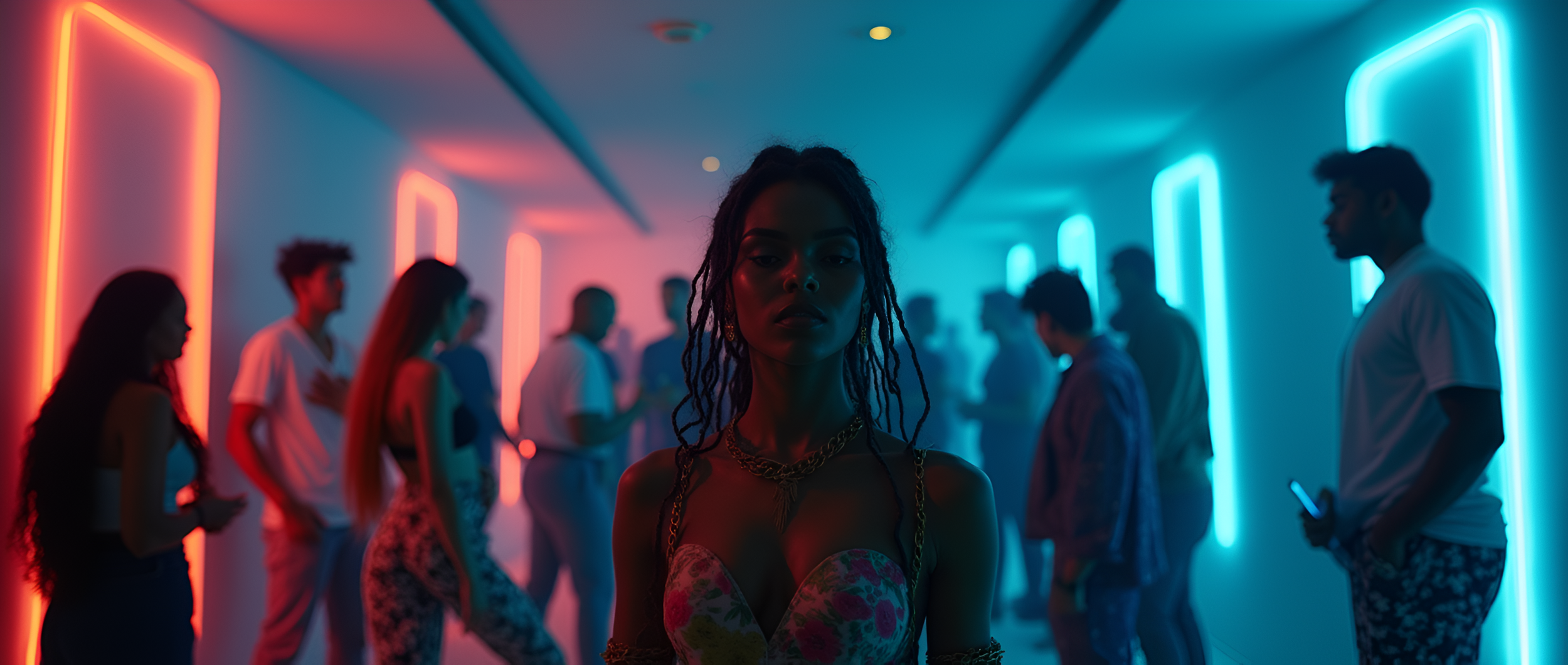
Aether
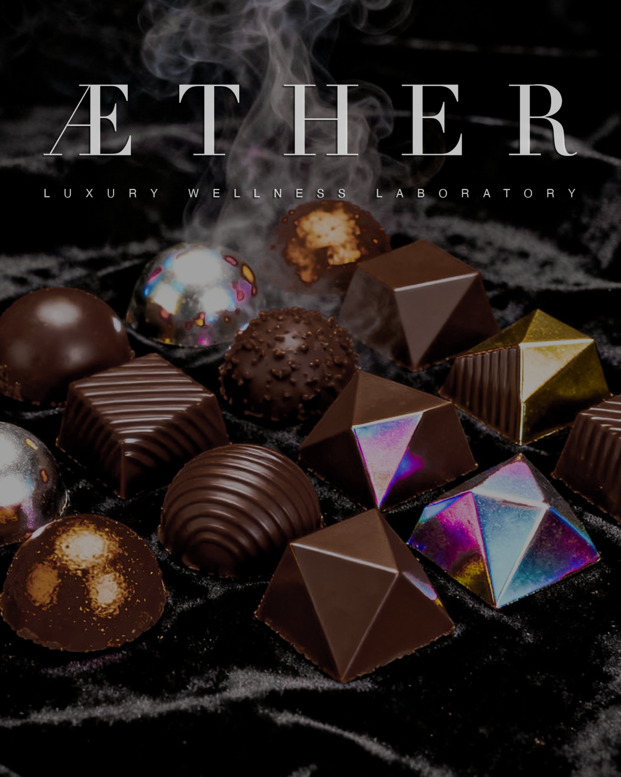
Repositioning a luxury cannabis brand through perception-first creative.
Less product.
More atmosphere.
Less explanation.
More suggestion.
Cannabis branding has long relied on familiar visual codes—loud graphics, ugly colors, and obvious symbolism.
What if it borrowed its visual language from contemporary fashion, music, and editorial culture instead?
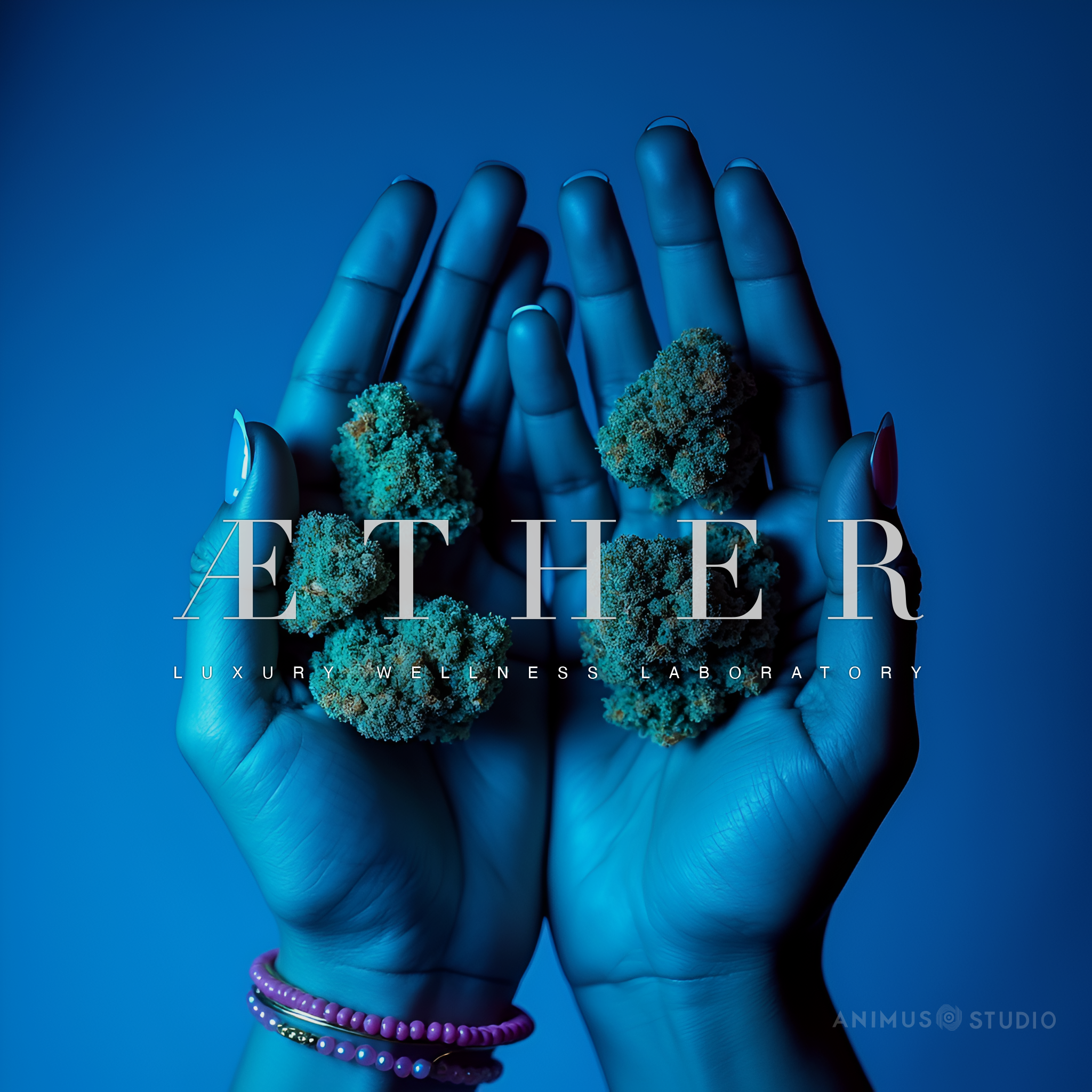
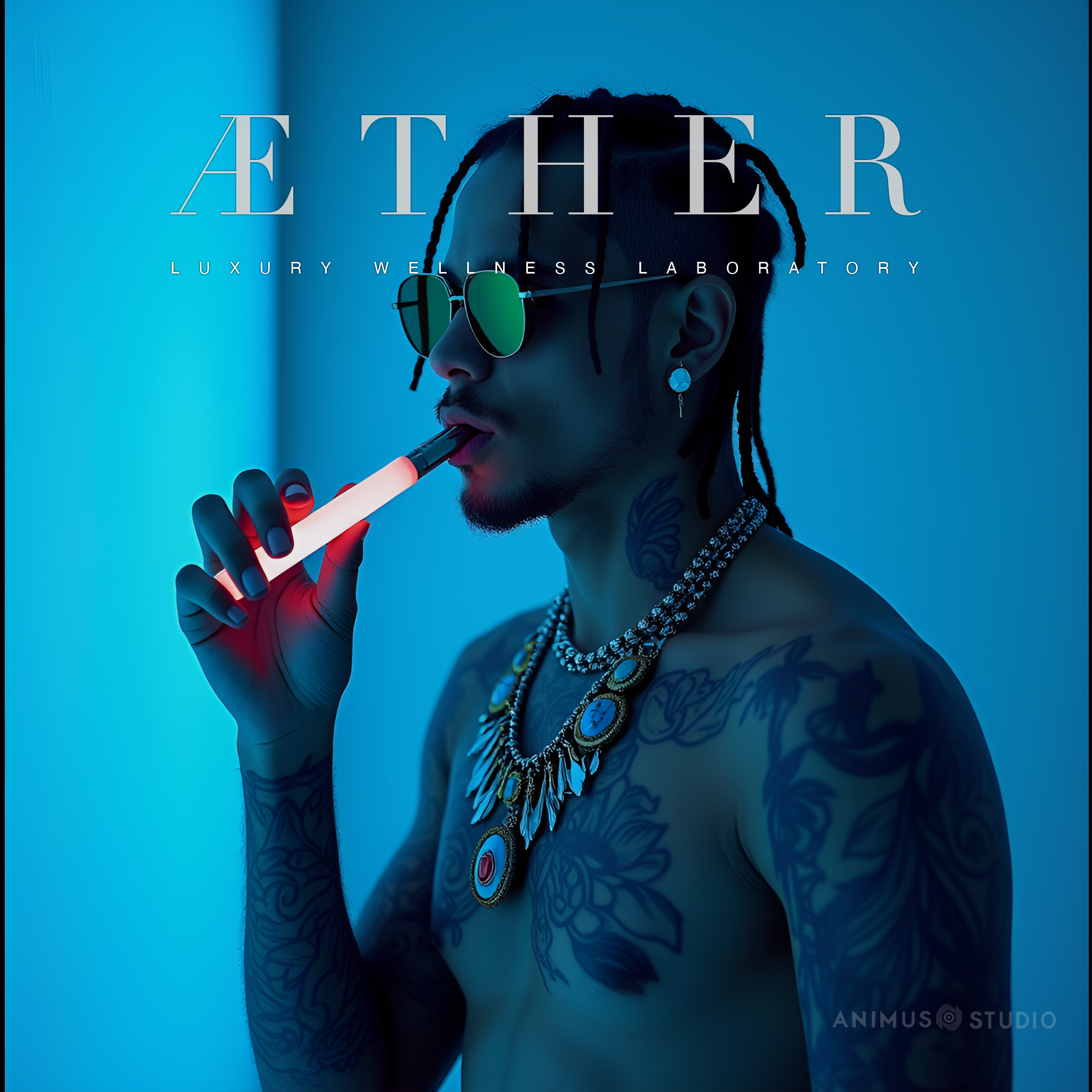
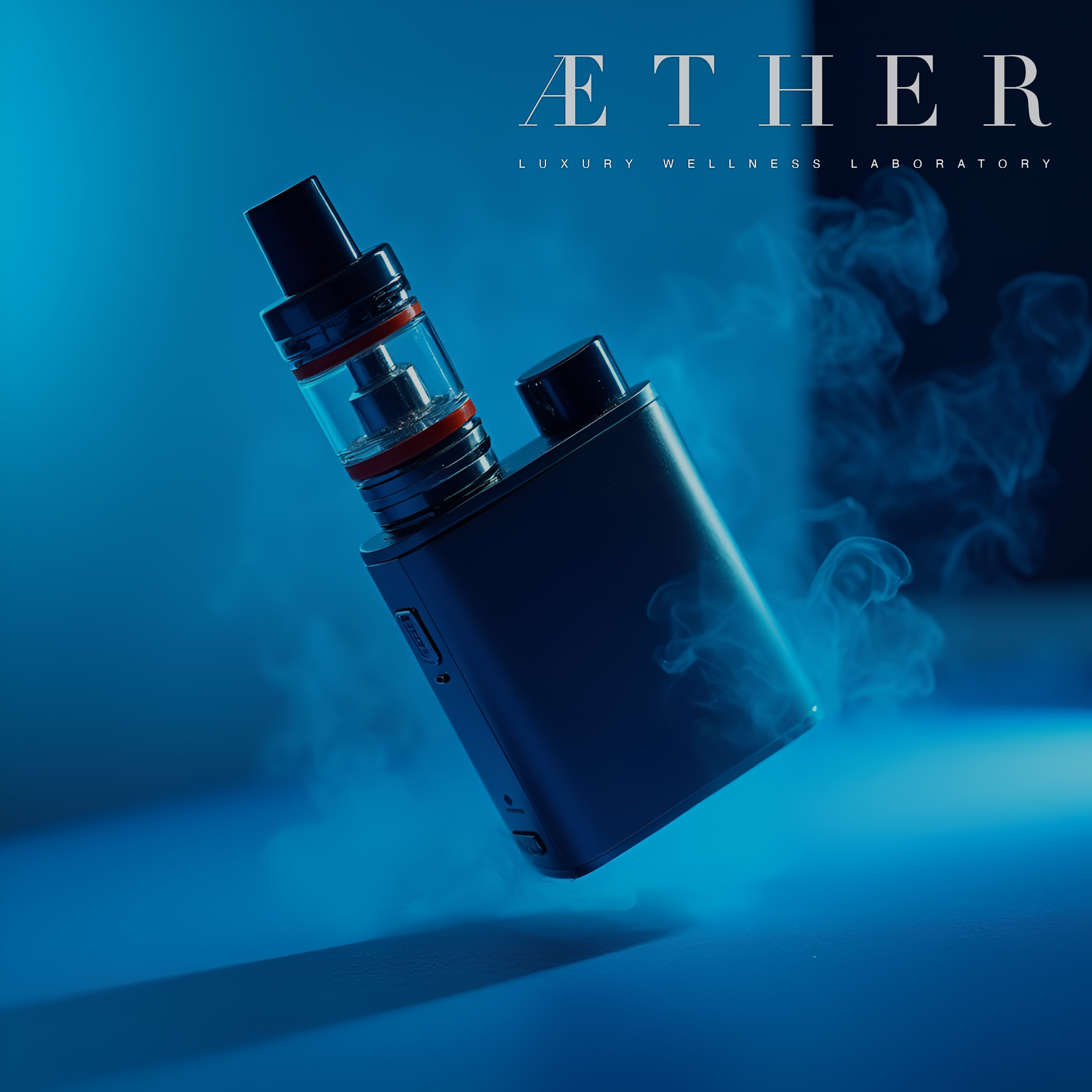
Campaign World



Motion